
StudySpot
An app designed to help students find study spaces on campus.
Working with the Innovation Hub at the University of Toronto, my team and I sought to create a digital solution that addressed one of their five domains of innovation. We focused on the Access for Every Student theme, and specifically on how students use study spaces.
StudySpot is an app that students can use to find their ideal study space. At a glance, they can see the location of spaces on campus, noise-level and amenity information, and estimated occupancy levels based on a QR code check-in system.
Problem Statement
Students do not know where most study spaces on campus are or how to find them, resulting in overcrowding of the main libraries and underutilization of other spaces.
Team
Aisha Momand
Al Oatridge
Ginny Ekvall
Isabel Bowman
Nidhi Bhandari
Trevor Cross
Tools
Balsamiq
Figma
Mural
Photoshop
Google Forms
Google Slides
Timeframe
5 Weeks
My Responsibilities
I conducted the majority of the UX and UI design for the creator portal and the desktop reader application. I also conducted in-depth research on RSS to ensure the designed applications would be compatible with the technology
I conducted the majority of the primary research analysis and, based on the ideas of my teammates, created all of the low-fidelity prototypes. I also compiled all of the mockups into the storyboards and was responsible for adding interactivity and making the prototype "clickable".
Constraints
This project took place at a time when there was much uncertainty about the COVID-19 restrictions. Some restrictions had ended while others were coming back into effect. While this highlighted the need that StudySpot was trying to fill, it also made it difficult to talk to students about studying on campus as many of them were avoiding studying at the university entirely because of the pandemic.
Primary Research
To better understand the challenges students experienced regarding study space, we first distributed a survey and conducted interviews.


We analyzed our survey data and organized our qualitative data into an affinity diagram.
We assumed the main problem would be related to booking spaces, but based on the data, the biggest issue was finding study spaces that meet students’ specific needs.
Key Findings:
59/68 respondents use study spaces
Study spaces are used for a variety of activities (group work, individual activities, online class, etc.)
Commuters and students who live close to campus face similar issues
28/38 of students who use bookable spaces dislike the process
Finding information about study spaces is difficult.
Persona
Using the information from our survey and interviews, we created a persona called Seth the Studious, a Master’s Student looking for a place to study.
In reference to our early observations, our driving question became: How can Seth avoid studying on a bench when better spaces are available?


Empathy Map & As-Is Experience Map
Using the collected data, we pulled quotes and determined what Seth would be thinking, feeling, and doing as he looked for and used various study spaces.
His thoughts, feelings, and actions were then mapped onto an As-Is Scenario and each team member voted (represented by the pink dots) to identify the main pain points we wanted to focus on.

Needs Statements
Using the main pain points, we developed Needs Statements that our solution must address to be considered successful.
Ideation
With Seth’s needs in mind, we came up with some big ideas, grouped them by theme, and voted on how impactful and feasible each theme would be to identify the ones we wanted to move forward with.


Finalized Key Ideas:
Real-time availability
Ability to filter by amenity
Map of study spaces
Quiet level information
Prototyping & Lean Usability Testing
With our key ideas in mind, each group member drew their own low-fidelity prototype. Then, I synthesized our ideas into a single prototype for usability testing and helped arrange it into a storyboard.
To evaluate the design, we conducted lean usability testing with 4 students. We guided them through the prototype, having them share their thoughts about specific screens, features, and the app as a whole.
Findings:
There should be a home screen before users see the map
The labels for certain buttons, icons, and filters were not clear
Users should be notified if a space fills up while they are on their way to it

Medium Fidelity Prototype
With the feedback from usability testing, we iterated and improved our design, using Balsamiq to create a medium-fidelity prototype.


Medium Fidelity Prototype
For further testing and review, I created a storyboard for our prototype and made each of the flows interactive.
Summative Evaluation
We conducted a final round of usability testing on the new prototype. Seven students were given the following prompts and asked to verbalize their thought processes while we observed them navigate the interactive prototype:
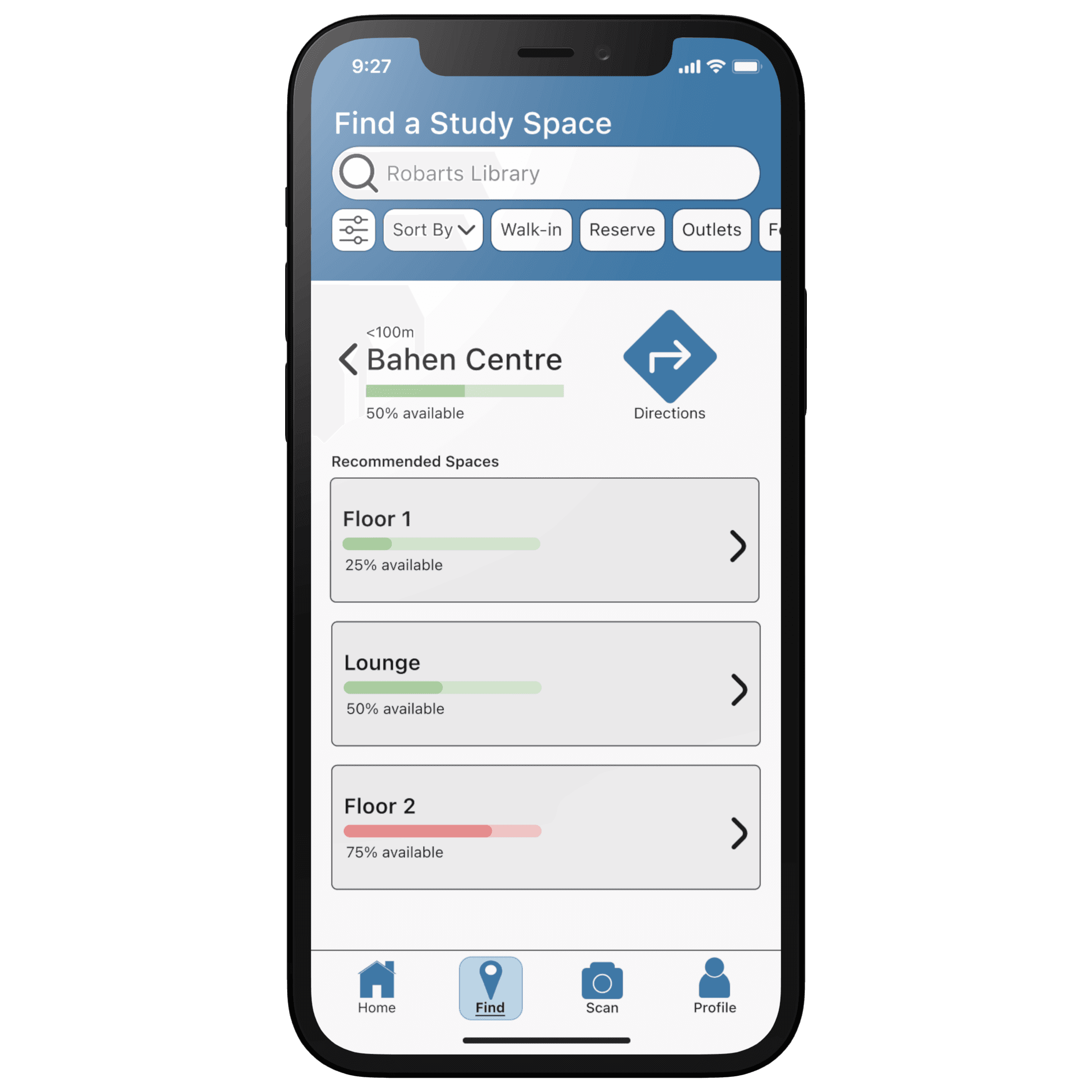
How would you find a walk-in study space in the Bahen Building?
How you would book a room at the Robarts Library?
Having arrived at the space, you see a QR code on the desk. How would you check in?
We followed the tasks with a short interview.
General Impressions
We asked participants to rate the usefulness and how easy the app is to use on a five-star scale.


Overview of Constructive Feedback
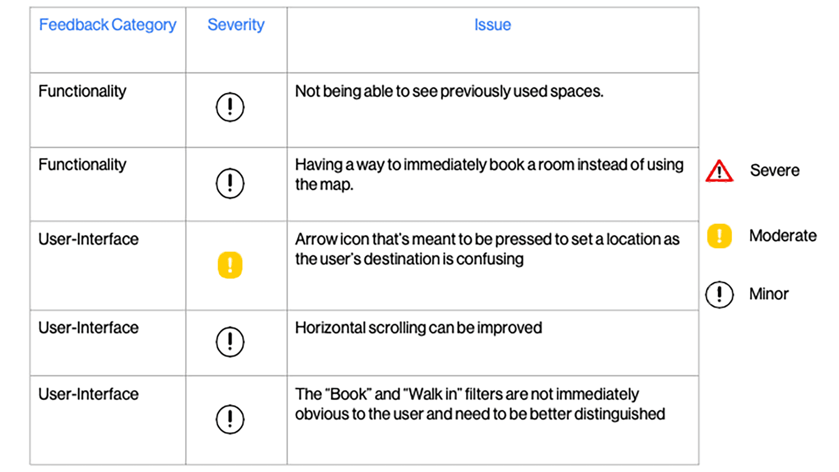
Finally, we used the results of our evaluation to identify areas of improvement that could be addressed in a further iteration of the design.
Reflections
If I were to complete this project again, I would want to put greater emphasis on evaluating the QR code system in our usability testing. Getting more input from users on whether or not they think they would use the system, or what type of incentive could be built into the app to encourage them to scan the QR codes would have been useful and made our user-centred design more robust.